According to a Google Trends data collection in November of this year, the term “infographic” was 5% more likely to be searched for, so now is the time to start something new. That will help your content to be more potent. This year is the year of video, but infographics are also an interesting presentation format.
For starting an infographic, in addition to having information in hand. You still have to think about doing it yourself. or hire an expert which has a high price for newbies or small brands who do not have enough budget What's the big problem? Fundamentals of design and design, which are the most important steps. Where to choose the right color scheme Easy to read fonts And also have to look at the overview that the Infographic is not too cluttered.
Here are 5 tips to help you easily know the design skills you need to make an infographic.
1. have free space
Having some free space around an object (image or text you want to emphasize) will draw the reader's attention. And also to say that this information is important.
2. Use contrasting colors.
There should not be too much color in each section. If you want to use contrasting colors, it should not be more than 2-4 colors, because if more than that. The reader will not feel eye-catching. Avoid using bright colors. all in one section or if there is a black background Using dark gray or dark colored text would make it difficult to read.
3. Pay attention to font and text style.
In general, you should not use more than 2 fonts or a maximum of 3 fonts and also use fonts that are consistent with the content. Because your readers think of what they're reading based on the font style. which do not forget that the facts Or the information contained in the infographic is important. If you choose to use a teenager font in academic articles People may view that matter. It's not very serious, so you need to pay attention to it.
4. Select an icon.
An important thing that infographic creators must keep in mind is that the icons they use must reflect what they want to say, for example, using a picture of a coffee mug. to convey an overview of the coffee business Because icons are considered universal languages. that connects readers from around the world to your brand
5. Don't forget to think about the image on the web page.
When the work is done You don't want the infographic to be crowded on your web page. You have to keep the whole picture in mind. Most infographics are 816 pixels wide and 1500 pixels tall. Or the picture is not too close to the edge, this is to facilitate the reader.
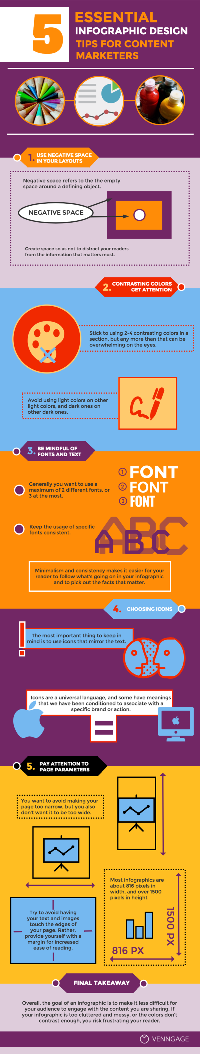
Source : VENNGAGE


0 comments:
Post a Comment